Monday, 23 March 2015

Kinetic typography


This is a Kinetic typography video that I have found using the song MAPS by Maroon 5. The transition from word to word is very clean and each word has it's own illustration that goes with the actual word. I found this inspirational because I like the fact that each sentence of the song has it's own composition. From one word to another and how sentences of lyrics are strung together to create the entire song. The illustrations used also work well and are very clear and strong, they fit in with the words and help the song as a whole flow better. the type is also more understandable because of the use of illustration but there isn't too much illustration which doesn't take away from the actual text.
I have tried this with a song I have fond in my free time and its something I want to try again and is something I am very interested in.

Good magazine layout


I have started to look at magazine layout and what interests me the most about magazine aesthetic, I have found layouts like this which combine the use of Modernism and Post modernism into one magazine; the type is quite modernist because of its bold and powerful appearance. Where as the layout of the image with the placement of the type and the master header has quite a post modern aesthetic which I also like when combined with a modernist style. 
The colour scheme is very strong, black and white combined with another colour like yellow contrast well. I want to try this rule of three colours in some of my work to see if I can produce the 
same result. 

Friday, 20 March 2015

Photoshop tutorial: Pear and Rocket (APPEARANCE PANEL)


In this tutorial we created a rocket using only 4 shapes, and a pear mesh using the mesh tool and eye dropper tool to fill colour and the appearance panel to make the different textures of the rocket.

To create the rocket we created 4 simple shapes.

1) Rocket itself
2) Window
3) Wings
4) The squared pattern

To create the rocket we using the Pen tool, we then manipulated the outline by adding anchor points and changing directions to create a curved point and a base for our rocket. After this we curved in the edges by adding another anchor point and rounding it off by dragging the anchor point down. We did the same for the bottom curve. We used the pen tool to freehand the wings of the rocket, then edited it with the direct selection tool and anchor points to make the wing look more like a realistic wing of a rocket. 

After this we added a dotted line in the shape, by going to the appearance panel and making a new stroke, with this stroke we then selected 2px thickness this gave us a solid line which ran around the rocket, we made a dashed line simply by selecting "Dashed line" we selected a "minus" offset stroke which meant the stroke would appear inside the rocket.  


We then created the wings using the Pen tool creating a basic wing shape a duplicating it to create two wings for the rocket. After making the wings we made the pattern for the inside using the appearance panel to create an offset pattern which we then put into the rocket itself.
A white rectangle and two overlapping green rectangles, this made the crosshatching pattern that would be inside the rocket itself. After we added this we used the appearance panel to create the inner dashed lines, we used the same effect on the window which we created using the ellipse tool and finished our rocket off by adding a drop shadow creating an atmospheric effect.

The Pear:

To create the pear we used the mesh tool, we started with a rectangle and added a mesh to said rectangle, we then moved the mesh around so that it was roughly the same shape as the pear. After we had our mesh in place we added anchor points spanning across the pear mesh which allowed us to be able to render our pear.

We used the eye dropper tool on each and every anchor point we created, this proved to be quite a daunting task because of the amount of anchor points we created; going through each anchor point was a bit of a pain. But the end result was a good one, once we had rendered our pear we found a texture from the internet. I used the texture of a pear I found in the hope that it would more realistic, I was right and the pear was finished. Overall I was happy with the outcome and both tutorials as
a whole.
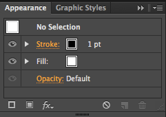
 This is the appearance panel which we used, in these set of options were different settings which allowed us to change things like the stroke of an object, the fill and many more options which allowed us to create patterns out of shapes and offset paths like the dotted lines which went inside my rocket.


TYPE TRANSCRIPT (Testing the typeface)


I have tried to use my alphabet in other words to see if the alphabet is legible and easy enough to read, I am happy to say that I feel the typography piece has worked well! I asked numerous people and all were able to read the words that were on the screen. "The quick fox", "Bad comb" and "Snake cider" Therefore I feel that the alphabet as a whole has been a success because of how people can read the words in my own font.

Here I have tried the words in a colour, however after trying this in colour I feel that it takes away from the type more than it provides the appearance now looks childish and since my font is not aimed at a particular child like audience I won't be using any colour on my type. 

TYPE TRANSCRIPT (Vectorised alphabet)


This is my completed Alphabet I have vectorised on Adobe Illustrator. After creating my final alphabet by hand I decided that I should try and vectorise my alphabet on Illustrator to make it look more professional. I decided to use a block as a feature which appears in every letter, I like this because I feel like it cements the alphabet together and the familiarisation of the block I have made makes each letter appear similar.

I used the pen tool and guides to create my letters, the guides helped me adjust lines on the each letter so the style was the same throughout each letter. The alphabet's italic style is very powerful I will try the alphabet out using a sentence to prove that the alphabet works well as a whole.