Showing posts with label Process and Production. Show all posts

Wednesday, 29 April 2015

TITLE SEQUENCE: "Happy Graphic"


This is the latest after effects tutorial that I did, the aim of the tutorial was to create an animated title of any words of phrases that you wanted. Combining the skills I had already learnt in the last tutorials of the position and opacity tools and the 3D tools that we learnt in this tutorial. 

Step 1: First we spent some time deciding what we wanted our title page to look like, I decided to use the words "A HAPPY GRAPHIC" I felt that I could do a lot with this phrase and animate the words in different ways to make it more interesting. 

Step 2: Once we had decided what to use it was time to start making it! I used a bold font on Adobe Illustrator and used two different colours Red and black to make the "Happy" word stand out from the rest of the phrase. 

Step 3: Once I had created the phrase on Illustrator I imported the phrase into After effects and started using different effects like the position tool and the rotation tool to start to make the text move and animate. I also tried out some options called the 3D options which allowed me to make the text look 3 dimensional. Axis options, bevel and emboss and drop shadow options were just some of the effects that were in these options. 

This tutorial was very helpful because it introduced me to a completely new set of skills in after effects. I will be using the 3D options in future because they are a clever way of bringing an animation to life by creating an atmosphere for text and objects! 

Friday, 24 April 2015

Photoshop tutorial: (ROTOSCOPING)


By using the brush tool and a colour of our choice we traced the dancer's movement to create our own character that moved and copied the actions of the dancer, we did this by using the timeline to move along the frames by using the next frame button, this gave us an accurate measurement of where and how the dancer was moving every second. The short time between frames was beneficial because it meant that our character was only moving slightly every frame, this made the video as a whole much smoother, the short frame times the better! This method was very laborious and was quite boring but the end result was worth it and the outcome looked smooth the transitions between frames were tight.


This was the timeline. (Window, Timeline) We created two new video layers one for the footage of the man dancing and one for the layer on which we would draw our character. This was a pretty simple process and a good skill to learn even though it was quite laborious I enjoyed using the timeline for the first time in Adobe Photoshop. 


After we made the gif animation we moved onto created a movie animation. We did this by importing some footage into photoshop after we created a new layer. The first thing we had to do was open the timeline in the window options, once we did this we could create a new video layer which sat on the top of our footage. On this layer we could draw whatever we wanted I decided to draw the man dancing as a stick figure and use the new frame button to redraw the stick figure on each frame to replicate the mans actions as he was dancing. This was a fairly short tutorial but one which I enjoyed and although I did not quite finish the whole video I feel as though I have gained a lot of experience in using frames in photoshop which before I never knew was possible!

Thursday, 23 April 2015

Photoshop tutorial: Animated GIF (PHOTOSHOP TIMELINE)


Firstly, we set up our document. We created a custom document because of the unique height and width of the pixels, we used a 300 pixels width by a 100 pixel height. this gave us lots of room to be able to play with and left plenty of room for our animation to animate in. The resolution didn't matter as we were only creating a quick and simple gif. 


This is where we learn a bit more about the timeline option in photoshop. To start to create the animation we created 10 different video layers and create a different object on every layer, I chose to create circles because i felt that this was a quick and simple gif using geometric shapes and i was focused on learning how to create the gif rather than the final outcome. Once we had our layers we selected the create frame animation button; this sent all of our layers onto one single layer on the timeline. we then selected the drop down menu on the right hand side of the timeline and selected the make all layers button. This made the 10 separate layer we once had in the order we made them in. We could then go onto creating the actual animation. 


These are some stages of development of my animated GIF, first we had to set up the photoshop document. we created a work space of 300 pixels by 100 pixels this is the normal size of most animated gifs. Once we had it set up it was time to start.

Step 1: We went to Window and selected Timeline.
Step 2: We created ten different layers and I used a geometric shape on each layer.
Step 3: Select Create key frame animation button
Step 4: A single layer appears, go to the drop down menu on the right hand side and select the button which creates the layers separately so there are more than 1.
Step 5: Mess around with the timing by selecting all of the layers and clicking on the time at the bottom of one of the layers in this case we changed it to 0.1 frames per second.

I was very happy with this tutorial, I learned a new skill that I never new was possible on photoshop (Animation) I found that the process of creating an animated gif was quite simple and useful for future if I were to create website designs with gifs which feature on the design. This is definitely one to remember for the future and I enjoyed the tutorial in general, I felt that I learned a lot from
this tutorial.

Friday, 20 March 2015

Photoshop tutorial: Pear and Rocket (APPEARANCE PANEL)


In this tutorial we created a rocket using only 4 shapes, and a pear mesh using the mesh tool and eye dropper tool to fill colour and the appearance panel to make the different textures of the rocket.

To create the rocket we created 4 simple shapes.

1) Rocket itself
2) Window
3) Wings
4) The squared pattern

To create the rocket we using the Pen tool, we then manipulated the outline by adding anchor points and changing directions to create a curved point and a base for our rocket. After this we curved in the edges by adding another anchor point and rounding it off by dragging the anchor point down. We did the same for the bottom curve. We used the pen tool to freehand the wings of the rocket, then edited it with the direct selection tool and anchor points to make the wing look more like a realistic wing of a rocket. 

After this we added a dotted line in the shape, by going to the appearance panel and making a new stroke, with this stroke we then selected 2px thickness this gave us a solid line which ran around the rocket, we made a dashed line simply by selecting "Dashed line" we selected a "minus" offset stroke which meant the stroke would appear inside the rocket.  


We then created the wings using the Pen tool creating a basic wing shape a duplicating it to create two wings for the rocket. After making the wings we made the pattern for the inside using the appearance panel to create an offset pattern which we then put into the rocket itself.
A white rectangle and two overlapping green rectangles, this made the crosshatching pattern that would be inside the rocket itself. After we added this we used the appearance panel to create the inner dashed lines, we used the same effect on the window which we created using the ellipse tool and finished our rocket off by adding a drop shadow creating an atmospheric effect.

The Pear:

To create the pear we used the mesh tool, we started with a rectangle and added a mesh to said rectangle, we then moved the mesh around so that it was roughly the same shape as the pear. After we had our mesh in place we added anchor points spanning across the pear mesh which allowed us to be able to render our pear.

We used the eye dropper tool on each and every anchor point we created, this proved to be quite a daunting task because of the amount of anchor points we created; going through each anchor point was a bit of a pain. But the end result was a good one, once we had rendered our pear we found a texture from the internet. I used the texture of a pear I found in the hope that it would more realistic, I was right and the pear was finished. Overall I was happy with the outcome and both tutorials as
a whole.

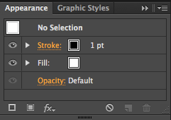
 This is the appearance panel which we used, in these set of options were different settings which allowed us to change things like the stroke of an object, the fill and many more options which allowed us to create patterns out of shapes and offset paths like the dotted lines which went inside my rocket.


TYPE TRANSCRIPT (Testing the typeface)


I have tried to use my alphabet in other words to see if the alphabet is legible and easy enough to read, I am happy to say that I feel the typography piece has worked well! I asked numerous people and all were able to read the words that were on the screen. "The quick fox", "Bad comb" and "Snake cider" Therefore I feel that the alphabet as a whole has been a success because of how people can read the words in my own font.

Here I have tried the words in a colour, however after trying this in colour I feel that it takes away from the type more than it provides the appearance now looks childish and since my font is not aimed at a particular child like audience I won't be using any colour on my type. 

TYPE TRANSCRIPT (Vectorised alphabet)


This is my completed Alphabet I have vectorised on Adobe Illustrator. After creating my final alphabet by hand I decided that I should try and vectorise my alphabet on Illustrator to make it look more professional. I decided to use a block as a feature which appears in every letter, I like this because I feel like it cements the alphabet together and the familiarisation of the block I have made makes each letter appear similar.

I used the pen tool and guides to create my letters, the guides helped me adjust lines on the each letter so the style was the same throughout each letter. The alphabet's italic style is very powerful I will try the alphabet out using a sentence to prove that the alphabet works well as a whole.

Friday, 27 February 2015

KINETIC TYPE: "Personal experimentation"


After I created a small typographic animation I used these skills to start to create my own animation using a song I like, I used the skills I learnt using keyframes and transition to create this small animation, it isn't completely finished yet but I am happy with the transition and the effect from one to another.

Thursday, 19 February 2015

KINETIC TYPE: Final


This is the final design of my typography animation I created using a combination of Adobe Illustrator and Adobe after effects.

STEP 1:  I started by making three different designs on illustrator for the different sections of my text, I chose a background that I thought would work well with the meaning behind the quote and the font I was planning to use. I created the three different sections of my text by creating a new art-board by holding the alt key and duplicating the first rectangle to create two more along side it. 

STEP 2: I then decided on the text I was going to use, I tried to use a variation of different fonts that worked well together to keep my animation interesting and decided I would use a combination of AVENIR (ultralight), Century Gothic and AVENIR (Regular) I found that these fonts worked well together because the styles worked well in transition with each other. 

  I created the video using animated keyframes and the transform options to make the text move and appear from one place to another. I created transitions from one piece of the quote to the other by creating a new solid under the layer option so it seemed as if I created separate animations and blended them together. 

I also used the ease in and ease out tool which makes the text I was transforming shift from one place to another with a more finesse this made the keyframe transitions work better together because of how they blended seamlessly without any movement which would appear too sharp. 

Wednesday, 18 February 2015

KINETIC TYPE: "Illustrator setup"


These are the storyboards I created in Illustrator ready to be switched over to After effects

STEP1: I set the screen size to 1920 x 1080 ensuring that I was working in pixels.

STEP 2: I chose a background colour keeping in mind how I wanted the text to be presented and how the background colour would work well with my particular quote.

STEP 3: Once I had a background colour and I was happy I then imported my text into illustrator and began work on font and style, I split my quote up into 3 sections which made three 
separate storyboards.

STEP 4: I used AVENIR NEXT (Regular and ultralight) because of how adaptable it is to different styles and background, I found that even though it had a thin style the font still worked well with the quote because of it's delicate approach which wired well on any word. 
I used CENTURY GOTHIC (Italic and Regular) for the parts of my quotation that was more important, these words could then be out into bold to make the stand out more and become the most important words. 

STEP 5: Once I had all of my text I experimented with size and layout, trying different ways of fitting the quote together even in a block text or in a separate part of the art-board. I also added rectangles to the background which emphasised the most important words even more, I like this look because of how it uses a very bold style to convey a message. 

STEP 6: Now that I was happy with everything I then imported everything over to After effects and worked on the animation side of things.


Tuesday, 17 February 2015

TYPEFACE TRANSCRIPTION: (3 ALPHABETS)

I also like this alphabet, because of its simplistic aesthetic, I used 2 diagonal lines to create a basis for my designs the consistency is strong and looks successful as a complete alphabet. I have the idea of combining the second alphabet with this one by maybe using the black rectangle in the place of the two diagonal lines because I like how the block creates a strength to the different letters.


I really like this Alphabet I have used the black rectangle as a feature in each letter of my alphabet in different ways this creates more of a consistency throughout my Alphabet which I like, the letters are easy to distinguish from one another and offer a wider scope of development that the other 
alphabets do. 


This is my least favourite alphabet because of it's lack of consistency, I can see how I have developed the alphabet using lowercase letters with straight lines and curves but I don't think that this alphabet works as well as the other two which are a lot more consistence and look much more like an alphabet that this one does. 


This is my experimental page of my different typographic alphabets I looked at 
various different artists and created sketches of shapes that could be evolved 
into alphabets by using different features from the art pieces. 

KINETIC TYPE: "Style research"


This is a style I have found that I am very interested in pursuing in this new After effects project, I researched a channel called KINETIC typography on Vimeo and found a whole range of different inspirational typography piece that could be adapted to my quote. 

I found this Typography piece by Matthew Rogers on vimeo, the use of transition from one word to another is very appealing but I feel it could be widened to more of an animation styled piece. 

He uses very distinct movements of words to replicate the tone and sharpness of Stephen fry's voice, I believe this style could be widened by adding more punctuation in pauses to replicate how Stephen is talking. I also think that different font could be used with different transitions to expand on important words. This would work well with Robin williams quote because of the amount of pauses and different words he uses.

KINETIC TYPE: Research "My quote"


This is the quote clip I am going to use in my next After effects project, I find the quote to be beautiful but simplistic and complicated. The way Robin Williams words the quote taken from the DEAD POETS SOCIETY is very soft, I feel that the various pauses in the quote benefit me to fit more transitions and animation of the various text to make the quote blend together a lot better. 

Monday, 16 February 2015

Artist inspiration for type (El Lissitzky)


El lissitzky- An artist I have found inspirational when I was developing my typefaces. His use of geometric shapes and lines in a composition or design work well and create certain feelings about that are suggested in some of his work. I like the way diagonal lines are used in lots of his work and thin lines are used against bold geometric shapes to add depth and contrast in his work which I find appealing.


Works Like these have inspired me because of there use of diagonal lines, there are plenty of shapes to be found in artworks like these and I will use this to my advantage when experimenting with my typefaces.

Thursday, 5 February 2015

Adobe InDesign tutorial: (TYPE SETTING)

Type setting involving Widows/Orphans tutorial notes

In this tutorial we will learn about widows and orphans and how they make type setting looking inconsistent and unprofessional looking. 

Widow:  is a line of text at the end of a paragraph separated from the rest of the text, meaning that this line is either in the next column or in the next page. It can also appear as an opening line of a paragraph at the bottom of the column or a page, thus separated from the rest of the paragraph.

“Orphan” is a word or few words in its own row that end a paragraph, thus creating too much white space between paragraphs. These white spaces in a paragraph can be identified as being called "Rivers" this makes the type setting look inconsistent and not nice to look at. 


Here is a picture of some examples I have found on widows and orphans. It makes the type look messy and and hard to read, there are a number of different ways to solve this problem in InDesign. 

1) Justifying the type using the "Justify type" buttons. 
2) Using tracking and kerning to makes the space between words and letters more or less. 
3) Making the type itself larger or smaller by using the sizing settings.
4) Using the hyphenate button. 

All of these are different ways of making the type beautiful and clear, it also makes everything easier to read and makes the whole aesthetic of the type a lot more aesthetically pleasing. This was a helpful tutorial in learning how to justify and make my type beautiful. I will use this tutorial to work with my magazine to make the type setting the best I can I will watch out for things like orphans and widows and correct them so they look professional. 


InDesign tutorial: Magazine layout (DTP POSTER)


This is my cover, I kept the cover looking minimalistic by not adding too much information which would overcrowd the magazine. I used AVENIR ULTRALIGHT as my font I felt that the thin style of the font offered a more simplistic value which I wanted to add into my magazine cover.


I also made some double page spreads, I tried to focus on where the font would be situated. I aligned the text so that each paragraph was the same size and length this made the layout more pleasing and overall made the layout of the text and the whole page loo more professional.


In this instance, I used a white text which I was happy with. However, the white font was not clear to see on this background I used, I had a number of choices because of this. I could change the image to match the colour of the font, change the colour of the font to match the image or use the rectangle tool to create a separate background for my font to sit on.


I am happiest with the layout of the text on this page and how I have used long paragraphs and short paragraphs which I think creates interest.

Friday, 30 January 2015

CHARACTER ANIMATION: After effects


This is the animation I created in my After effects lesson, Firstly I created my object on Illustrator as a vector image because I felt that the quality was much better than Photoshop for creating this kind 
of thing. I ensured that every part of the object was saved onto a different layer this meant I could animate individual layers instead of just the phone itself. 

After I was happy with my illustration and the features I wanted to animate I imported the file into After effects making sure my work space was set at the correct width and height (1920x1080); After everything was set up and I was ready to animate I decided that the phone would look the best if it actually appeared to enter my scene. 

I created this effect by using the position tool and the parenting tool to assure that the screen layer would always follow the phone itself, I then used an array of different tools such as the Opacity, Rotation and position tool to create animation and motion for the different layers of my iPhone. 

After I went through the effects and animation process I added a texture to the background to give my animation another point of interest and more depth, I imported the image as a jPEG and put the textured background behind my background layer, I then used the Multiply tool on my background layer to make the layer more transparent which allowed the texture to show through and create a 
nice effect.

Overall I am very happy with how the animation has turned out, the animation is smooth and crisp and there are points of various speed between the keyframes which gives the animation a variation of speed and interest. 

Tuesday, 16 December 2014

"Final Layout"


This is the layout of my my final design, I went to the technology building to make this test print. 
 I noticed I had to turn my bottom designs upside down. The reason for this was that having the bottom designs the correct way up would be upside down when folded! Having the designs turned on there head made it so I could create a single fold down the middle of the separate pages so that the pages were back to back and aligned correctly. 

I am happy with the overall layout of my final book, I am happy with the type faces and titles that are on the covers. I love how the idea of the illustration being unveiled is presented and how you have to open up other pages to get to the main illustration. 
This also means that every page is going to be looked at in order to get inside the book which I think is great because no information can be missed out when my consumers are looking at my designs. 

Friday, 12 December 2014

MOVIE TRAILER: Final


This is the trailer I have created using the different photographs and the effect I downloaded free from cutestockfootage.com I have also used music I have downloaded to create the feel of a horror movie, this coupled with the crackling film effect and background noised from the audio adds to the effect of a horror film. 


Tuesday, 9 December 2014

MOVIE TRAILER: Edited photographs


These are some of the Photographs I have edited so far, I have used different effects and techniques to make the individual photographs pop more and become more relevant and in keeping of the horror theme for my trailer. 

I have used Levels and Curves to make the image contrast from dark to light I didn't use brightness and Contrast because of what I learned in the last tutorial that Brightness and Contrast tends to ruin the image slightly and you lose some of the textures and other important aspects of the image. 

I also used Hue and Saturation to make certain colours stand out, I used this on the Photograph of the tracks because I wanted the blue to be the dominant colour which emphasised the grain in the wood and individual textures of the image. 

Overall these edits have gone well, I have come out with strong Photographs which I can now take to After effects to begin to swap over the older images with my images, I can't wait to start adding affects and grain to my trailer and watch as my horror trailer comes to life!

MOVIE TRAILER: Initial photographs


Here is a small select few of some of the new Photographs I have taken, the reason I decided to take new photographs was because of the quality of the photographs I took before simply weren't good enough! I took these Photographs with a great camera the Nikon DSLR and the quality and depth of my photographs are much sharper and crisper and will ultimately look better on my trailer. 

I am very happy with the photographs I have taken of Huddersfield train station, I will now use Photoshop to edit some of the Photographs I have taken to make them darker and add effects to create a feel for this horror trailer I am wanting to create.